
Using digital engagement to measure success at a community health center
Project type: Service & UX design
My role: Engagement Lead, Designer and Design Researcher
Additional team members: Designers (2), Design Strategist, Solutions Lead
Stakeholders: Customer Engagement, Blue Door Neighborhood Center (BDNC) Team, Information Architects, Guests to the BDNC, BDNC Concierge
Timeline: 12 weeks
The Blue Door Neighborhood Center (BDNC) offers health and wellness events, fitness classes, and health insurance information for everyone in the neighborhood — not just BlueCross BlueShield members. As these centers planned to scale across Chicagoland, our partners requested a better solution for people to check-in.
After research, we reframed this problem to one of measuring success and recommended additional touchpoints that were adopted by the center. These would improve both the center’s operational efficiency as well as ease the guests’ waiting experience.
Stakeholder Interviews
Stakeholder interviews: The Blue Door team initially asked us to solve “check-in” and “registration,” as their check-in and registration at the front desk took too long, and the data was often incomplete. We first asked stakeholders the purpose of “check-in” and “registration.”
What we learned: Stakeholders responded by saying that the check-in was there to eventually show the business and funders that we were addressing community health needs. It was also a moment of relationship-building between a staff member and community member.
How we applied learnings: Our problem quickly reframed from a check-in touchpoint to “How can we better measure the success of the center, via digital engagement?”


Immersion
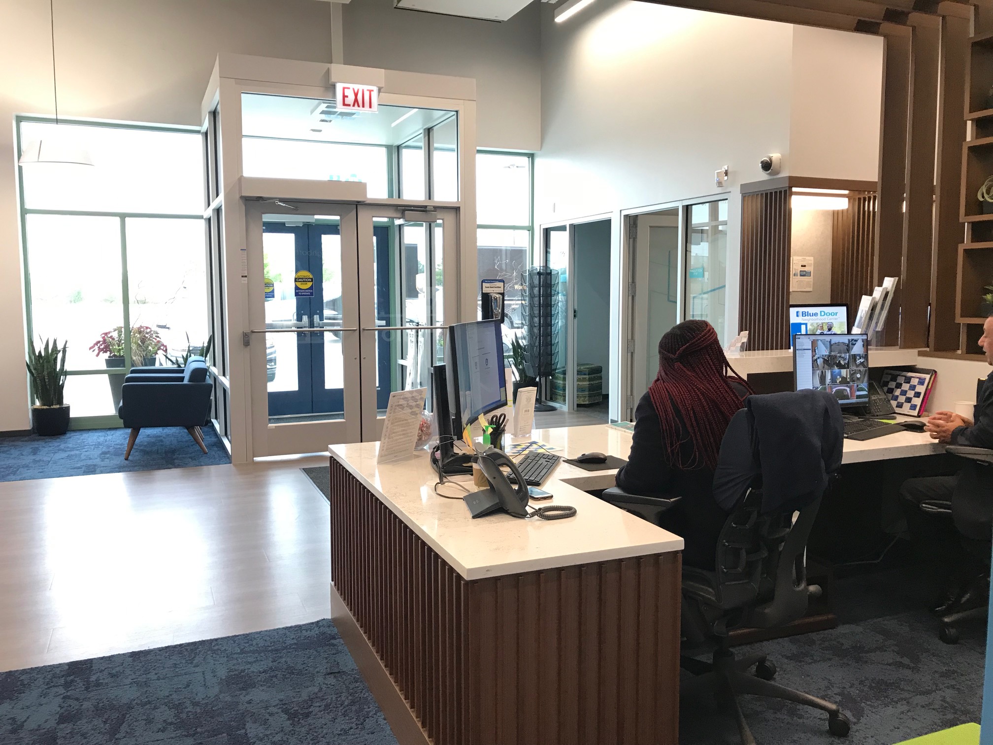
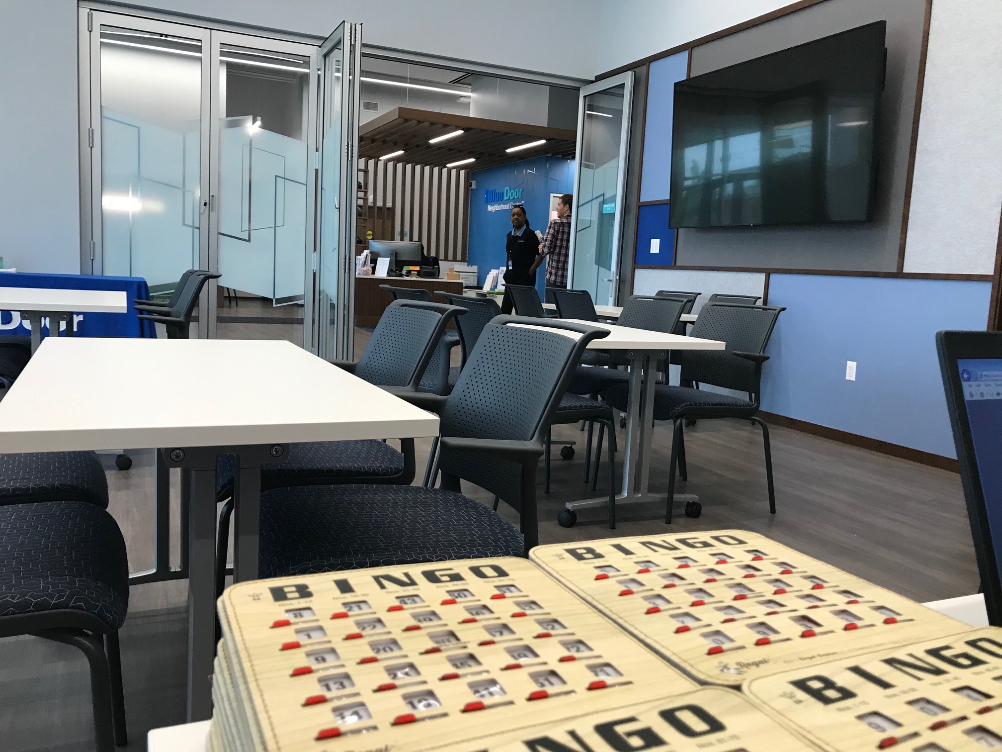
What we learned: The current audience the center served was older adults, but to be a community center, it needed to represent other community needs.
How we applied learnings: We distilled four audience profiles to illustrate who were current Blue Door visitors, and who represented potential visitors. By mapping these different audiences to a journey map, we demonstrated the highs and lows of the visit, and where digital engagement could be used to measure success.


Synthesis and Strategic Principles
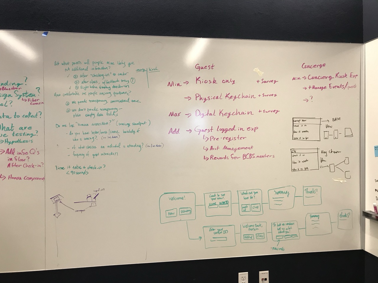
To improve engagement around check-in and registration, we created strategic principles to guide our designs and ideas. We brainstormed solutions based on these principles, across the member journey both at a high level and at a level that focused on the check-in moment. From here, two separate workstreams were generated — one for check-in, and one for the service overall.
Member-facing design principles
1.Progressive, In-stages: Treat it like a conversation
2.Private: Make them feel safe; No PII can be left on the screen
3.Transparent:Tell them why data is being asked for
4.Personable: Keep a conversational tone through digital channels.
Concierge-facing design principles
1.Accurate
2.Efficient
3.Clear
Some ideas focused on optimization, such as simplifying the Blue Door website and online activity registration. Other ideas demonstrated a need to think about check-in and registration at multiple points across the journey map.
What we learned: Principles guided us toward more defined solutions and offered justification to carry us forward.


Fulfilling requirements and Prioritization
At the same time that we were completing synthesis, product managers and owners were weighing the upsides and downsides of building a custom check-in solution in-house or buying a solution. They were still defining requirements and we emphasized our research and what was important data to gather in order to tell a story of the center’s success.
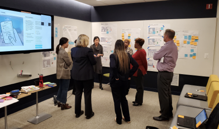
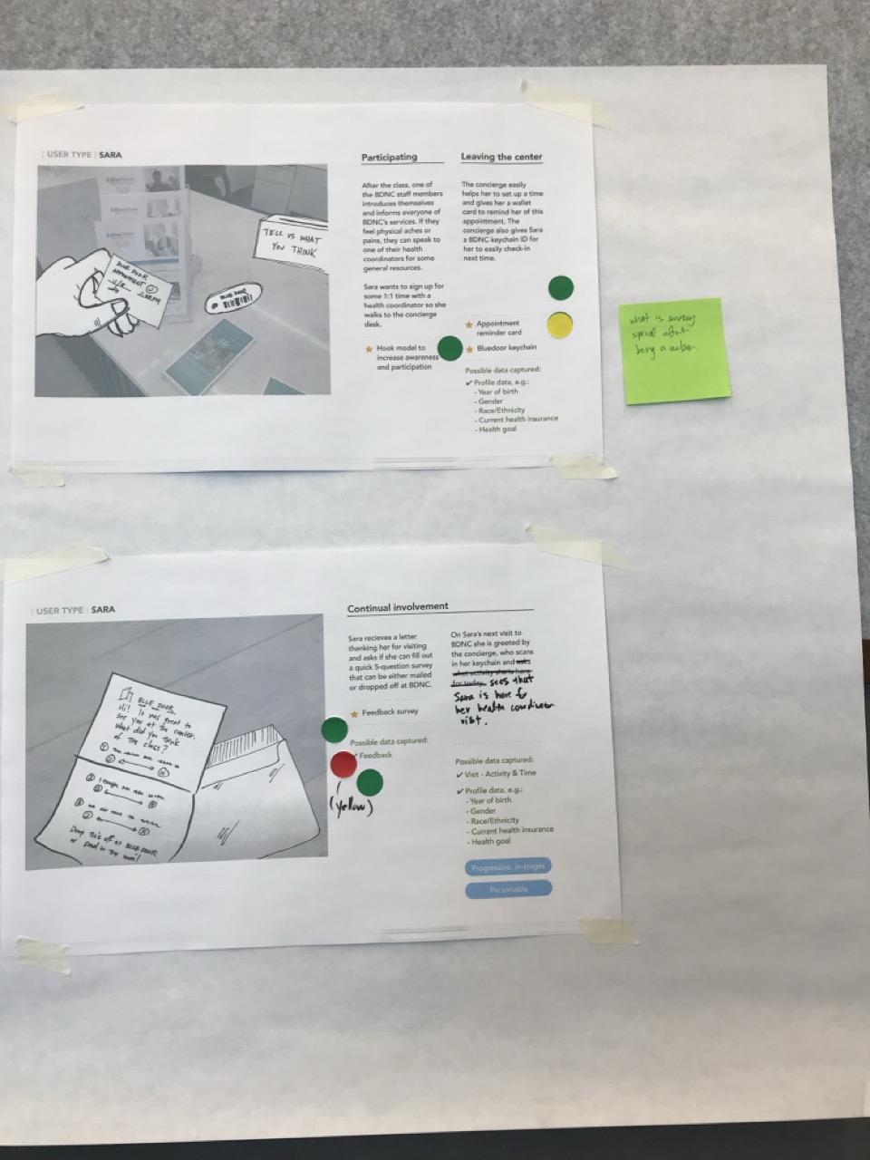
In a workshop format, we asked stakeholders to prioritize brainstormed ideas for check-in and registration. We also tracked data requirements and limitations of solutions.
What we learned: Self-registration was clearly of interest, while other ideas did not pass requirements of the Center and their state contracts.


Low-fidelity prototype
High-fidelity prototype
On-site testing
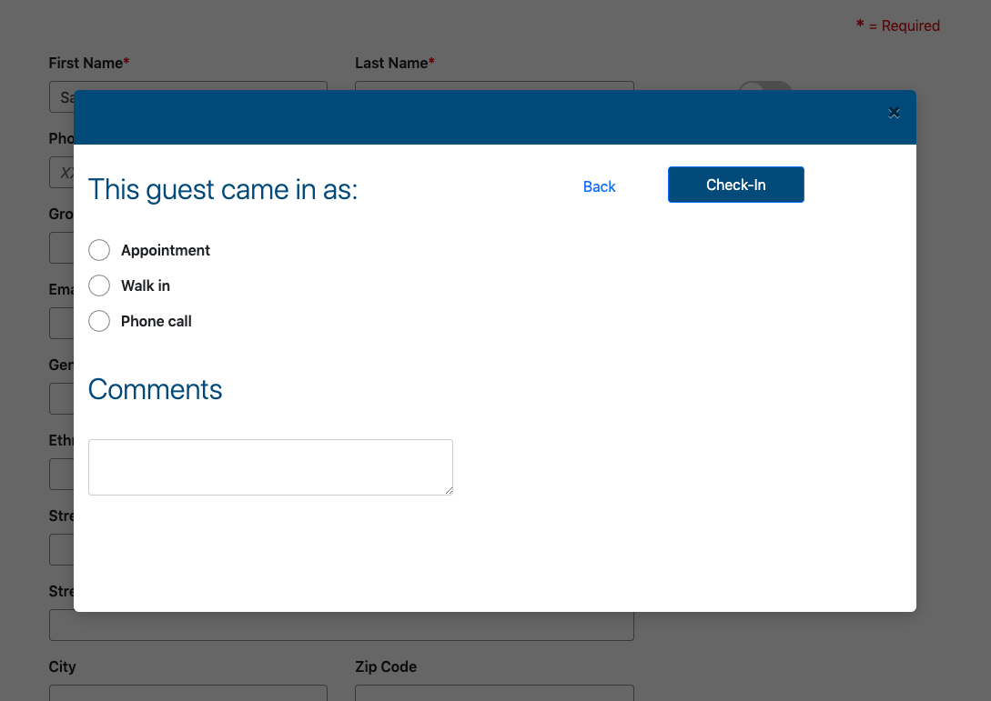
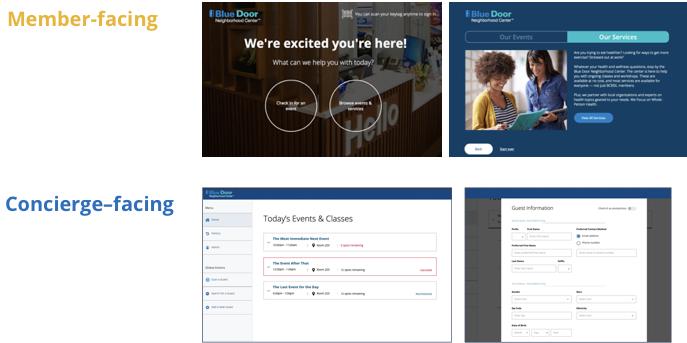
We prototyped and tested different two check-in flows for self-registration, conducting an internal A/B test to gauge whether or not self-registration was faster than concierge check-in. After we discovered that concierge check-in was faster, the value proposition of a self check-in declined. However, we continued to pursue it along with an improved concierge solution because it would be a secondary option and decrease overall wait times.
What we learned: At the Center, we conducted in-context behavioral testing as well as usability testing. The behavioral testing proved abysmal, as people experienced difficulty typing on the kiosk; standing was too onerous, and glare from the overhead lights made kiosk check-in challenging.
How we applied learnings: The kiosk was best used to scan member cards. A self-registration prototype could be tested at the guest desktops located nearby the concierge. Here, guests could sit and use a keyboard, which would limit the number of errors caused by a smaller tablet surface.
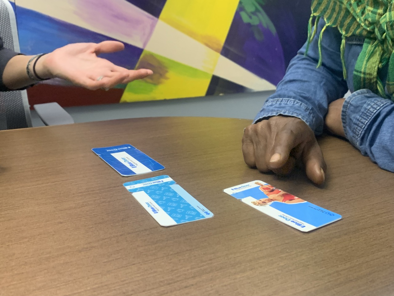
Additionally, we recommended use of a member card (card + keychain combo) as a way for easy check-in and to build long-term relationships with guests. I prototyped this as research stimuli, and it was well-received.

Translating to Salesforce
Closer to the end of the project the BNDC project team decided on a buy solution with Salesforce. This led us to craft design recommendations for Salesforce based on our existing design and principles.
We also offered guidance on self-service kiosk dimensions given our in-person testing demonstrated larger size needs, and recommended that they initially test a self-service solution on desktops they have at the center, where people could access keyboards.
What we learned: While our custom design was not implemented, our team continued to engage with BDNC stakeholders to build out the Salesforce application according to our recommendations. Additionally, they moved forward with member ID cards.


Outcomes
Our team applied design principles for the Blue Door microsite and concierge-facing check-in to improve and scale check-in and registration process for additional centers. Additionally, they launched the Blue Door member card, which will enable easy engagement and improved follow-up with guests. Lastly, our team de-risked the development of a self-registration kiosk, given the challenges we saw with the behavioral prototype.
While self-registration was slated for future releases, the team and stakeholders recognized the value of thinking how to engage with guests across their entire journey from before the physical visit to after leaving. The Blue Door team won several company awards that year for this work on the check-in and registration.
OUTPUTS
Archetypes
Customer Journey
Design Principles
Check-in prototypes
Member card